Streamline loan tracking to increase on-time repayments by 20-30% for an emerging fintech market
Industry
Tools
Team
Role
Timeline
Challenge
Company began to scale up and late payments emerged, resulting in heavy operation and customers missing payment deadlines.
Outcome
Increased satisfaction for customers on both sides of the marketplace while reducing hours of operation, saving everyone's sanity
Achievement
20% - 30%
Increased on-time repayments
16 Hours / Week
Saved for Operations
20%
Increased Customers' Satisfaction
Initial Goal
Increase On-time repayments
Reduce Operation Workloads
Increase Lender Satisfaction
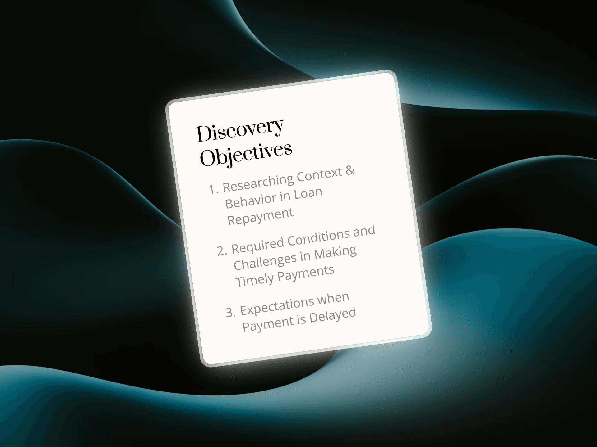
Discovery
Initially, we found the initial design not good enough and dissatisfied lenders' experience. But it is later found that the root issue stem from borrowers, the consumer side of the platform but the initial findings were:
Unclear Design
According to the consensus of customers and stakeholders, the initial design had a design that did not meet expectations.
Overwhelming Email
Email was a temporary solution but because of unmet design, it became the main channel for recurring payment, which makes the email cluttered for lenders.

Define
Once we talked with borrowers, the consumer side of the platform, we analyse data and uncover opportunities to improve
Funds Availability
Users are financially prepared for timely payments, and they favor convenience for instant payments
Prompt Payment
Users can be forgettable and they tend to rely systems to remind them payments.
Payment Summary
Users seek a comprehensive overview of their monthly expenses


DESIGN STATEMENT
How might we design a payment tracking tool that prioritize their expenses while also providing an overview to ensure timely payments?
Design
In the initial design stage, I involved developers, stakeholders and customers to validate the design, ensuring alignment across stakeholders.
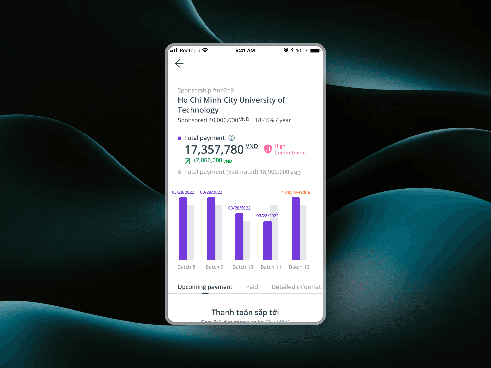
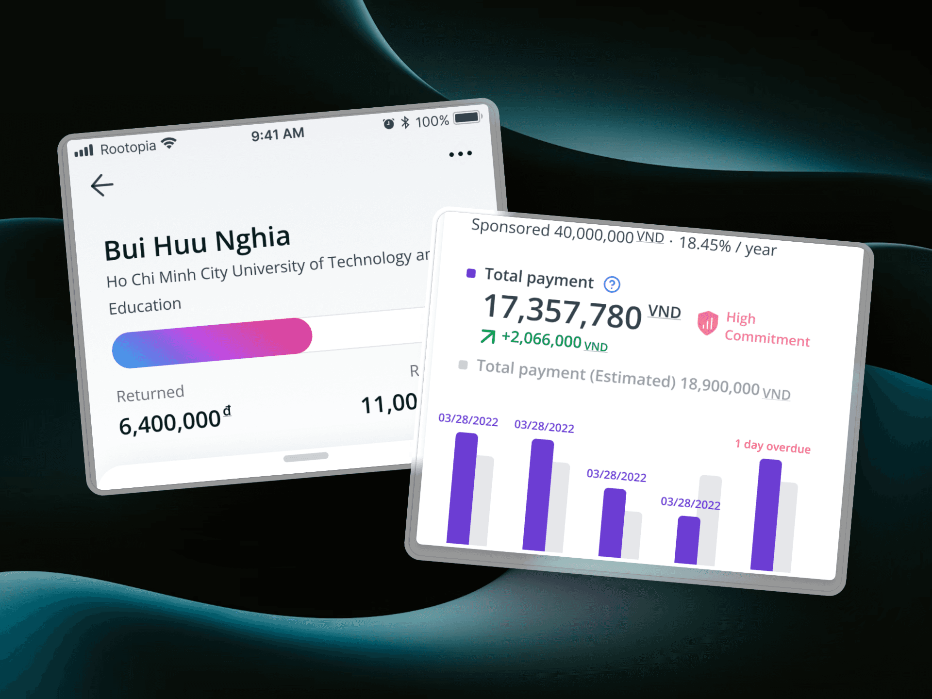
Column vs Line vs Progress Bar
For opportunities, we chose to tackle designing overview is critical to help sum up the experience. Progress Bar was the chosen design for its simplicity and matched exactly what users need: to track payment progress.
Chronological Timeline vs. Status Grouping
Between Status Grouping and Timeline, we were overly anticipated default loan and users just wished to track their payment in chronological timeline.


Iteration
We then continued with our iteration cycle by asked for more tests, including usability tests.
Detailed vs. Transparency
Transparency is one of our design principles. However, too much details can overwhelm users.
Returned vs. Principle
We overestimated our users' desire in returned or profit, but our users only simply want to make sure their payment and principle returned on time.

Outcome
Increased on-time Repayments by 20% - 30%
Progress and timeline design clarify payment statuses and deadlines. This gives them major confidence in payment.
Saved 16 hours of Operations
No more long hours work on the weekend and work overtime for our small team of mighty accountants.
Increased 20% of Customers' Satisfaction
Clear repayment breakdowns and timely reminders reduce delays, improving borrower accountability and lender trust for the platform.
Learning
Collaborate Early for early alignment and transparency across stakeholders
Fail Forward. Startups rewards flexibility and adaptability, not a rigid UX process