Landing Page that Increased 200% Sign Ups to Re-launch a New Lending Platform in a Low Credit Card Market
Industry
Tools
Team
Role
Timeline
Challenge
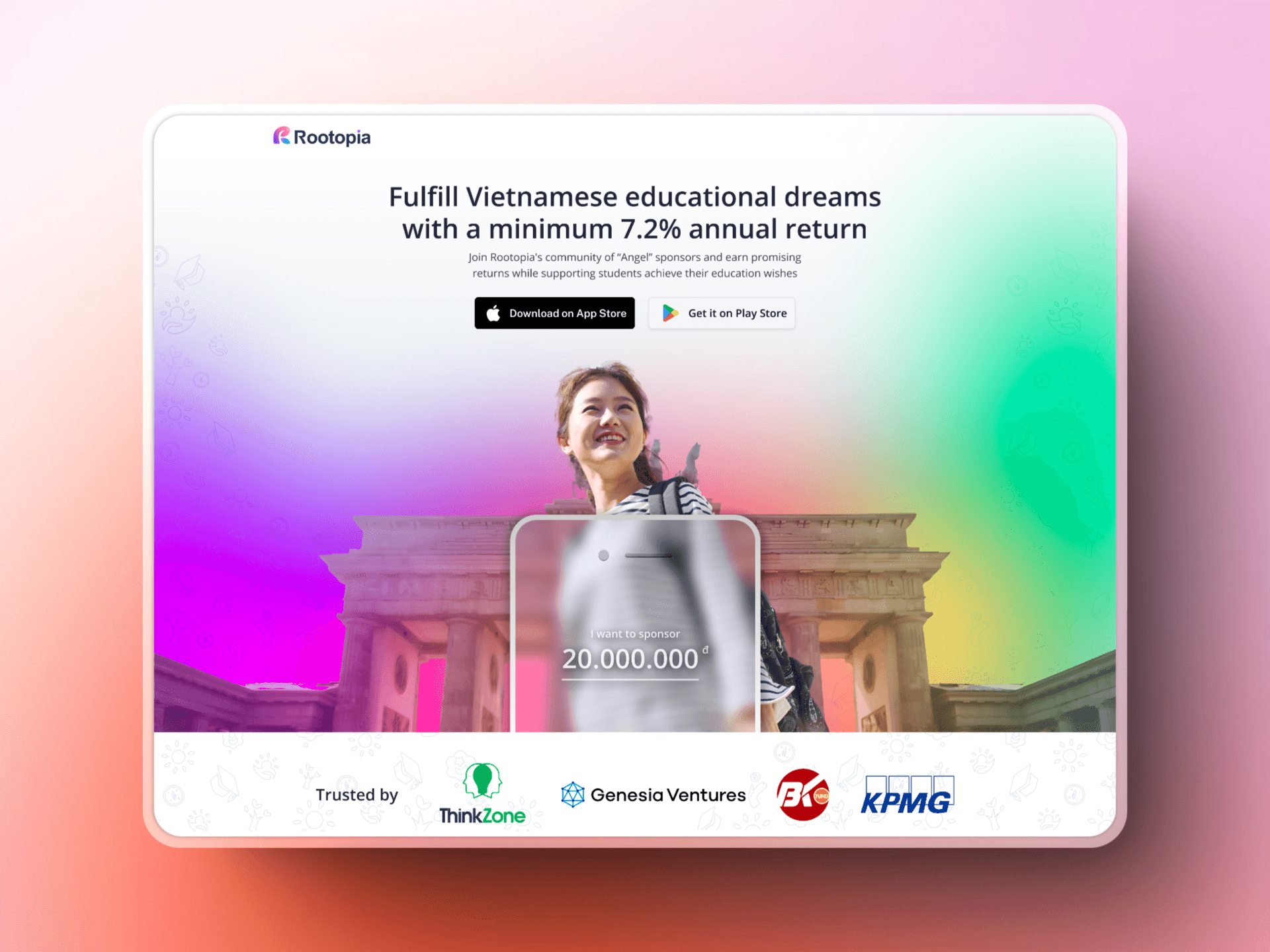
Launch a new peer-to-peer lending startup in a market that has doubts and stigma surround credit and loans
Outcome
Overcome the stigma while also establish the company's existence, brand and increase sign ups for the platform
Achievement
Twice
the Conversion rate
200% increase
in Sign Ups
Initial Goal
A regular landing page to test the market first
Discovery
In our first attempt, we designed the landing page to simply validate market need before product development. We learned that:
Unclear Value Prop. (4/5)
Combining with archaic visual style, while there was a clear positioning, there is unclear competitive edge for the product
Lack of Trust Elements (5/5)
Third-party financial verification, transparency, security features, and social proof are essential for website trustworthiness.
Landing Page’s Performance
Our first landing page performed below the industry average, around 1-1.5%.

Define
Given the feedbacks, we regrouped ourselves to make sure we came out stronger. Here are the activities that we did
Trust as Core Brand Value
This helps the company achieve its mission and goals, with "Trust" emphasized as a core value to build credibility, ensuring lenders feel secure and parents are confident in using the platform for their children's education.
Education-sector is underserved
We focused on the education sector due to a significant gap in Vietnam's education financing. With 47% of household income spent on education, many families struggle to access loans for tuition, leading to dropouts and limited opportunities.
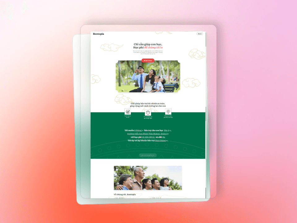
Minimalist Design to Reinforce Trust
As the founding designer, I worked with an external design agency to create a core design language that blends modernity, fintech dynamism, and minimalism to generate trust, especially given the sensitivity of financial transactions in education.

DESIGN STATEMENT
How might we convey trustworthy and transparency as our main selling points for a market that has high cultural skepticism towards lending?
Design
Once we gather feedbacks, we immediately looking for area that needs improvement
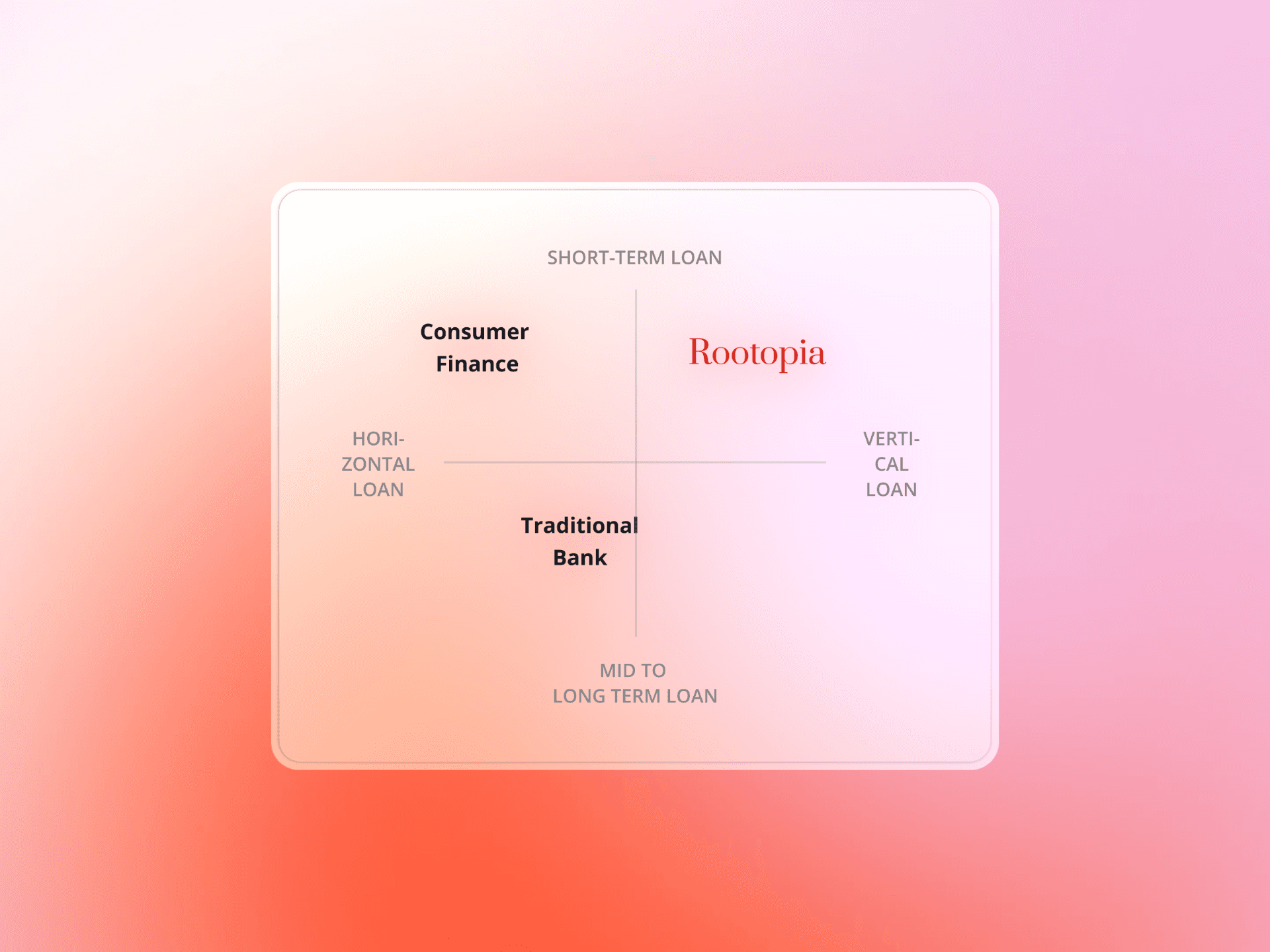
Specific Value Proposition
Thanks to the workshop, we are aware of our positioning, But to be more actionable, it needs to be very specific, by inserting numbers and how it lived up to the competition.
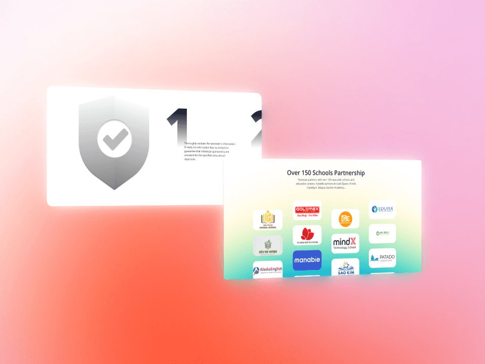
Trust Elements
In a market with significant stigma like lending, it is crucial to demonstrate how trust can be established. Some measures can address issues immediately, while others may not provide immediate relief like approval from KPMG.

Iteration
However, not all "trust" elements on your usual landing page would suddenly emerge.
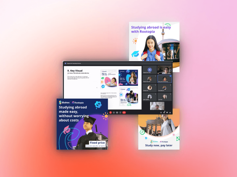
Trust building by showcasing features for investors
For individuals unfamiliar with investment and lending, these concepts may seem daunting. In order to stay competitive, it is crucial to highlight the value our products provide. However, this is no easy feat as it requires time.

Outcome
Twice the conversion rate
Hero image and copy clarified product positioning and competitiveness.
200% Increase in Sign ups
Protective mechanism from the nature of the business model and trust verification from reputable entities like KPMG and venture funds, along with partnerships with schools, enhance user trust and drive sign-ups
Learnings
Lots of time, good-looking visual isn't enough.
Faced uncertainty but proceeded with faith and action. Be prepared to say yes for new opportunities.