Design a Watch Face to Connect to Your Distant Loved One
Industry
Tools
Team
Role
Timeline
Challenge
Design a Watch Face that utilizes elements like time and weather meaningfully
Outcome
A Watch Face that helped you become closer with your loved one regardless of distance, and utilizing weather and time
Achievement
Highest Praise
Received in Class
8/12 Approval
for willing to try the product
Initial Goal
We aimed to create a watch face that help connection with the loved ones even when they are distant away with real time weather data and time.
Discovery
Given weather was the topic that we was required to tackle, that also where we first drew inspiration but it was not the only topic where we were inspired
Signature Language of Weather
The strong directional movement of the wind. The White of the Snow. The Misty and Rainy Sky for rainbows.
Real World Inspiration
Our color spectrum and icons started out take inspiration from the real world as well. But that was just the beginning.

Define
We split the team to pursure two opposite end of spectrum of visual (Abstract vs. Concrete)
Concrete vs. Abstract
We also gravitated towards the like of theatre and oil painting visual language. But whether they fit on watch face is something would need to explore further.
Rule of Two
Inspired from literature. It symbolizes the idea of distinct two world that can be polar opposites for two lovers.


DESIGN STATEMENT
We aim to design a watch face that connects loved ones through real-time updates on location, weather, and time, fostering emotional connection and awareness.
Design
Our aim is to design something that is most simplistic but also the easiest to convey the message
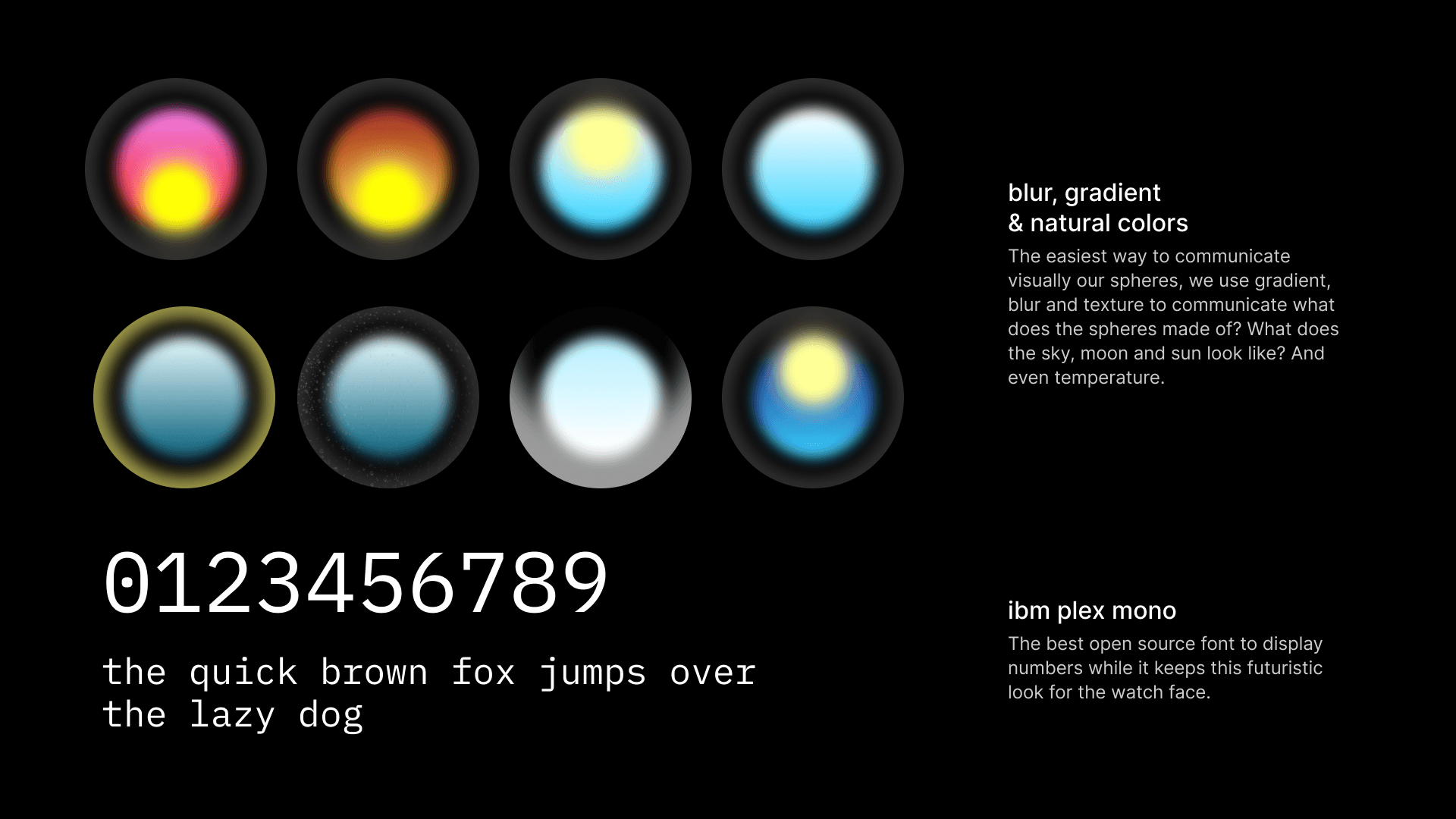
Sphere Metaphor
Have you ever seen those snow globes? Their sphere shapes not only promote simplicity but also it is the best metaphor to convey weather
Futuristic Typography
To match the feel and look of the abstraction visual the design tries to convey, IBM Plex Mono was the way to go and it also is great at displaying numerical as well.
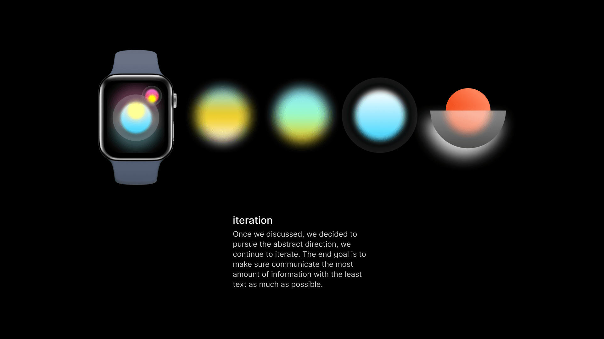
Iteration
Minimal Complications
We also played with typography and different complication design but to keep things minimal and focus to the spheres, we think text is the most effective way for our final design. In addition, putting name for each sphere helps reinforcing our design statement we try to address.